

Logo and KAPILAR name
The name of the Company KAPILAR was invented around 1990 and is a derivative of the Latin word kapilara (capillary). Capillary is the core of a thermometer, and this is the major product of the Company. This is a glass tube, hollow inside, filled with a liquid - tinted alcohol or mercury, reacting with its volume to changes in the temperature. The name was elected because:
- it is original and unique,
- it sounds well,
- it is universal due to its Latin origin and can be understood also outside Poland,
- the name is suggestive of the Company's trade.
Corporate logo has also been created around 1990. The project, beside a graphical element contains also stylized typographical representation of the Company name. Around the year 2000 the Company modernised its image and another design of the logo was created. Currently both logos are in use.
KAPILAR chose these logos for the following reasons:
-
both projects join functionalities of graphic signs and logotypes,
-
they are simple and therefore clear to the viewers,
-
letter „K" incorporates symbolic representation of a capillary - a part of a thermometer,
-
temperature symbol „0C" (degree Celsius) appears next to a capillary, enhancing its clarity and conveying to viewers the core product - a thermometer,
-
graphical symbol of a thermometer - a capillary - is used to connect another graphic element, namely laboratory glassware, which is another range produced. The flask is half-filled, with visible bubbles of gas - a sign of chemical reaction. This graphic arrangement further enhances the clarity, and the symbol exhibits certain dynamics through randomly scattered bubbles,
-
the typeface used in the logotype belongs to the grotesque type, recommended for companies involved in production of technical nature,
-
symbol ® (registered) informs potential plagiarists about legal protection of the sign in the Patent Office, and ordinary customer about the reliable company that cares for legal issues,
-
graphic sign and the logotype are correctly arranged and original. These features convey a positive image of the company to viewers, indicating that it can care for its customers just as it can for the logo.

 Useful files:

Menu
- ZRÓB WYCENĘ
- About us
- History
- Logo and KAPILAR name
- Quality Policy
- Glass wizards
- Professional certification
- Certificate PN-EN ISO 9001:2001
- Declarations of conformity
- Faktury zaliczkowe
- Procedura reklamacyjna paczek uszkodzonych w transporcie spedycyjnym
- Praca w KAPILARZE (PL)
- Patents and certificates
- The press about us wrote
- Scientific papers
- We were shown on TV
- Not only profits
- Warsztaty ze szkła ECO-ART
- Polityka plików cookies
- Ochrona danych osobowych
- RODO
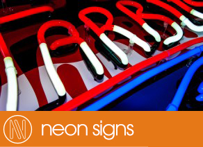
- Neon signs
- Historia neonów
- Reklamy neonowe
- Formy reklam neonowych
- Neony standardowe
- NeonArt (sztuka neonowa)
- Naprawy neonów
- Renowacje starych neonów
- Rurki neonowe
- Prowadzenie rurki neonowej w literach
- Ukształtowania elektrod i odsadek
- Współpraca z Partnerami (firmy reklamowe, oświetleniowe, dekoracyjne)
- Dokumentacja neonów
- Wzorniki kolorów neonów
- Tester rur neonowych
- Programy komputerowe
- Our neons on TV advertisment
- Najczęściej zadawane pytania (FAQ)
- Porównanie neony/diody LED
- Galeria naszych neonów
- Formularz wyceny neonu
- Reklamy
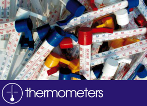
- Thermometers
- Szkło
- DIY winemaking